Tuesday, 20 December 2011
Friday, 25 November 2011
Optical Devices
Today we where looking at different optical illusions on this cool website. There where 12 optical toys in total, from Laura Hayes and John Howard Wileman's Exhibit of Optical Toys. These toys are old school optical illusion. I thought they where very interesting and had great information. It includes each toy along with it's History,Function and what became of it. Check it out!

Each toy was very fascinating, although my favorite would have to be the Thaumatrope. The Thaumatrope is basically a small disc with an illustration on each of this sides . There is a string tide on each of the opposite sides of the disc. When you spin it, the two images on each side will appear to be one.
Wednesday, 23 November 2011
Fascinating Photoshop Tutorial
Our task was to find an interesting tutorial for Photoshop. After looking through a bunch of tutorials, I came across this one. I found it super cool and easy to follow. I liked it because they plays with the size of the different pictures and manipulated them.
The scissors in the end product look very real/lifelike and don't look like they where just pasted in. It's kind of like there are a very large pair of scissors leaning onto the wall. Also The painting on the wall and painter actually look like they are present there.
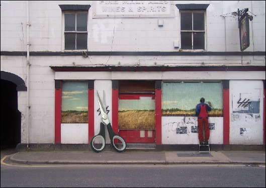
There are also a lot more cool tutorial's on this website. Enjoy :)
Wednesday, 16 November 2011
Photoshop Trial
SWINTER!

Before even starting I had to think of an idea for my surrealist picture. My picture is about winter and summer combining and merging to one. I thought about combining summer and winter because they are the two most opposite seasons.
First I opened an 8.5 x 11inch canvas in Photoshop CS4 so my picture would not turn out too small. Then I found a picture of a beach and set it as my base layer. After I made a new layer and added a picture of a snowman. I had to take the background out using the Lasso Tool and Polygonal Lasso Tool. Then used the same steps but put a picture of snowballs beside the snowman.
To make the snowman look more real, I used the Paintbrush Tool to colour the bottom of the snowman a yellow/beige to blend more with the sand on a different layer and made the opacity lower. At the end I changed the Brightness and Contrast to touch it up.
Monday, 7 November 2011
Thursday, 3 November 2011
My Chess Piece- The King

This is one of the assignments we got in CyberARTS. My drawing is of the king chess piece. Our goal in this assignment was to draw the chess pieces as realistic as possible. Also we had to focus on value, proportion, and shadows. The background had to have pattern and movement.
I started off by drawing my chess piece. It is not completely in the center of the paper, but closer to the bottom and slightly to the left of the page. The king was at eye level. First I drew the king without shading and then got into detail. After drawing it, I used a light shining from left to right. The lights made it easier to shade it in showing value. The pencils I used where HB, 2B for lighter to 6B for darker parts.
The pattern I used for the background where 3 metal bar looking objects going diagonal across the page. This moves your eyes to follow the shapes. I used similar shading/value as I did for the middle of the chess piece.
Wednesday, 26 October 2011
Composition In Our Photography

This photograph shows pattern. The parallelogram in the fence is being repeated. It is on going and the background (grass) is consistent. There is also contract between the fence and the grass.

There is symmetry represented in this photograph. It is shown because both half's of the picture are pretty symmetrical. The lighter gray in the middle of the drain defines the middle point. this makes each side more clear.

This picture shows a diagonal line because of the way the football players are lined up. The line they are standing on is also diagonal, starting at #56 all the way down. The presence of the white diagonal line draws your attention. It also shows perspective.
Sunday, 23 October 2011
Composition In Photography
Down below are two websites I found related to Composition in Photography. Click the titles to take you to each website.
10 Top Photography Composition
I think this website is very informative. It talks about the 10 top rules of photography. There are a lot of details when they talk about each rule. I also like the fact that the pictures help you understand what everything means. Also for the Rule of Thirds, the drawn in grid really makes the concept clearer.
I liked this website because I find it helpful that there are pictures as examples for each rule. Sometimes things are easier to figure out with pictures, because you can visualize it. I also like the how it told you what you should do, but also gave you a few things you shouldn't do/avoid. They weren't to long but had good information.
CHECK THEM OUT!
Monday, 17 October 2011
My Personalized Logo

These are the personalized logo's I created. To get started I had to research the meaning of my name.
My first name meant "river water" and my last name meant "owner of royal land." The qualities I found to base my logo around where River Water, Strong, and Royal. The images I originally thought of using for my logo where Crowns, and Jewels. I thought these objects where really affective symbols to represent my qualities, because they are so basic. If you where to look at them. Later I decided not to use those symbols. This is because it was too simple. There is more of a hidden meaning now. I decided to use a filled in outline of a girl standing with a blue swirl around her. This symbolized Strength. The blue swirl symbolizes Water, because water is strong in a way. It does not let anything go past it and is very Powerful. The girl represents Royalty because when you are royal, you are always surrounded. Royalty comes with protection, as well as being untouchable. My logo consists on a Filled in outline of a girl and curved lines surrounding it. I chose to fill the girl in with black because I thought it would stand out the most. It is a very bold colour. The outline is very smooth and there are no hard/sharp edges. There is a blue swirl around the girl. The blue swirl is the darkest at the bottom and gets lighter as it swirls upwards. This leads your eyes in an upward motion. The lines are very smooth. They also add cleanliness. I chose to interrupt one of the center swirls with my name. While your eyes are following the swirl, you stop at the name and have to read it. The black and white logo contains the same idea. Although instead of using the blue swirls, they were changed into different shades of grey.
The technical process of my logo was to draw/sketch my ideas in my sketchbook. After sketching the roughs, I used Illustrator to create it on the computer. I had to make many of them and decide which one I liked most. The logo was made using the brush tool. Later I used the typography for my name.
Overall I am happy with my logo. I think it really defines me and my personality. While making my logo I learned that it is very important to try different variations of your logo.
Friday, 30 September 2011
Grids
These are the two Grids our class created focusing on value!

The Third Class Carriage

Mona Lisa
(The Mona Lisa was meant to be vertically distorted!)
Tuesday, 27 September 2011
Logo Analysis


Logotype: The name is spelled out in unique typography.
The intended audience for this logo is kids. Every line has some sort of curve. They are very bold and stand out. The shapes in this logo are the stars. This is a geometric shape. They start with a small faded star and as it gets bigger, the colour gets bolder. This logo works because it’s not boring. The curvy font makes it seem very playful for a young audience.


Initials: The first letter(s) of the name.
The intended audience is adults. It has both a curved and straight line. It is white and bold. The makes the white stand out even more. There is a rectangle at the bottom of the f. Also a square around the entire logo making it stand out. The colours show it is rather simple. I think it is a good logo because it has simplicity.


Combination: Any of the configurations used together.
The intended audience would be anybody who watches videos online. The lines are very clean and a bit bold. The red rectangle in the back makes the word stand out. I think it says that they are simple but bold. I think it is a good logo because it is eye catching.


Pictorial Visual:
Representation of object or objects that symbolize the product, service or organization.
The intended audience would be Adults and teens. The lines are curved and portray the shape of an apple. You are able to tell what it is. The logo comes in many different colours to suite the product. It is simple but known by most people.


Abstract Visual: Non-pictorial.
This logo is intended for adults. There are curved lines along with sharp edges. The logo is abstract because you can not identify it to something in life. I think it is a good logo because it makes the company seem bold and stadn out. It is very eye catching. They have used a triangle along with a maple leaf at the top.
Subscribe to:
Posts (Atom)